Click the HTML icon in the toolbar above to edit spacer height.
TO EDIT: Change the class="spacer-3" to any number between 0 (none) and 5 (most) to resize a spacer. Ex. class="spacer-5"
Vertical spacers are responsive and 50% smaller on mobile than on tablet+.

Explore reimagined solutions at
IFT FIRST in 2023

Click the HTML icon in the toolbar above to edit spacer height.
TO EDIT: Change the class="spacer-3" to any number between 0 (none) and 5 (most) to resize a spacer. Ex. class="spacer-5"
Vertical spacers are responsive and 50% smaller on mobile than on tablet+.
Click the HTML icon in the toolbar above to edit spacer height.
TO EDIT: Change the class="spacer-3" to any number between 0 (none) and 5 (most) to resize a spacer. Ex. class="spacer-5"
Vertical spacers are responsive and 50% smaller on mobile than on tablet+.
Click the HTML icon in the toolbar above to edit spacer height.
TO EDIT: Change the class="spacer-3" to any number between 0 (none) and 5 (most) to resize a spacer. Ex. class="spacer-5"
Vertical spacers are responsive and 50% smaller on mobile than on tablet+.
600x600 - Immucor.png

Greater versatility, zero compromise.

Exhibiting made easier — so you can focus on results.

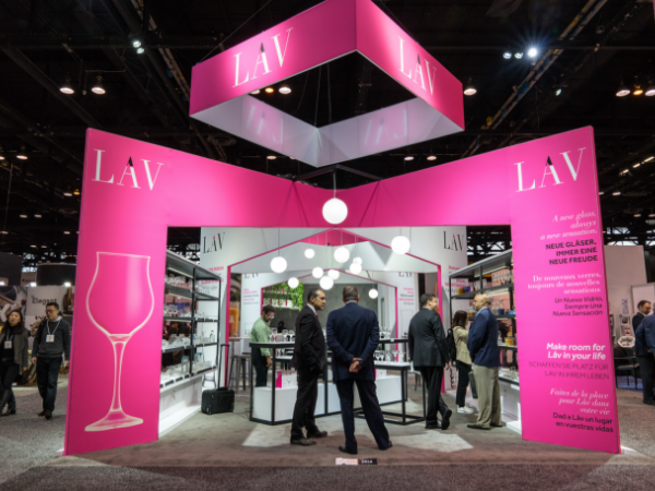
Design and flexibility shouldn’t take a back seat when you’re researching exhibit solutions. Our rental exhibits take a fresh approach, creating environments around your objectives and the all-important ROI.

Now is the perfect time to explore solutions that move the needle without risking your brand or budget:

Talk to our team


Click the HTML icon in the toolbar above to edit spacer height.
TO EDIT: Change the class="spacer-3" to any number between 0 (none) and 5 (most) to resize a spacer. Ex. class="spacer-5"
Vertical spacers are responsive and 50% smaller on mobile than on tablet+.
Ultimate-Guide-New_400x270.png

Make your trade show story in Chicago a success

You can create a compelling exhibit — at any size or with any budget at IFT FIRST. Whether you choose to rent your exhibit, go custom, or keep it simple, the formula for success is the same:

  • Maintain an agile, experimental mindset
  • Adapt and customize elements to your audience
  • Prioritize your return on investment

View the ultimate guide

Click the HTML icon in the toolbar above to edit spacer height.
TO EDIT: Change the class="spacer-3" to any number between 0 (none) and 5 (most) to resize a spacer. Ex. class="spacer-5"
Vertical spacers are responsive and 50% smaller on mobile than on tablet+.
Click the HTML icon in the toolbar above to edit spacer height.
TO EDIT: Change the class="spacer-3" to any number between 0 (none) and 5 (most) to resize a spacer. Ex. class="spacer-5"
Vertical spacers are responsive and 50% smaller on mobile than on tablet+.

Rental exhibit solutions

Options created with you in mind

Bring your inspiration, and we'll provide solutions designed around your objectives and budget.

600x450 - Vee Med.png
Rental solutions

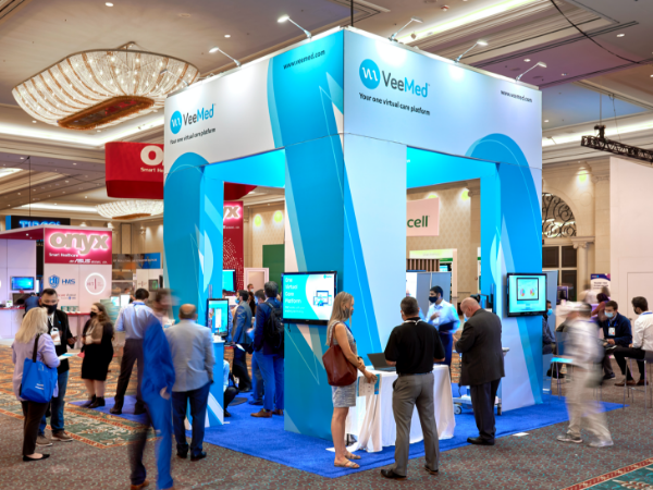
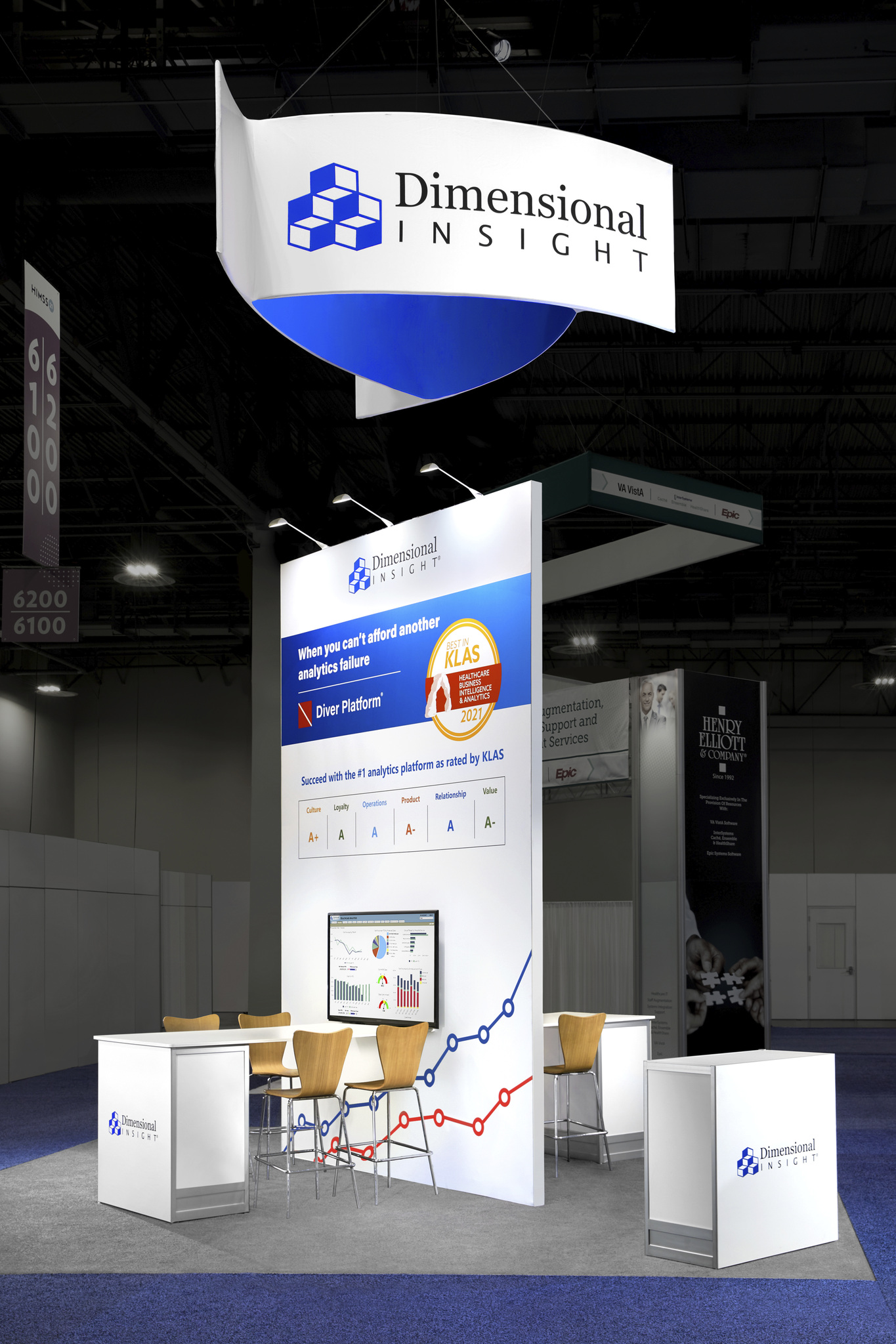
Get the ease of an all-inclusive solution with the option to upgrade or customize to enhance your attendee experience.

  • Single point of contact
  • Just show up and we'll do the rest
  • No surprises on your final invoice
  • Upgrade your AV and digital experience
  • 200 to 900 sqft

Let's get started

600x450 - LAV.png
Custom-designed rentals

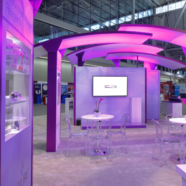
When you require a higher level of strategy, creative, and design resources to create an immersive brand experience.

  • Work with a designer to fully customize to your brand
  • White glove service, project management, and on-site supervision
  • Boutique results without the added cost
  • 400 sqft and up

Let's explore

Click the HTML icon in the toolbar above to edit spacer height.
TO EDIT: Change the class="spacer-3" to any number between 0 (none) and 5 (most) to resize a spacer. Ex. class="spacer-5"
Vertical spacers are responsive and 50% smaller on mobile than on tablet+.
Click the HTML icon in the toolbar above to edit spacer height.
TO EDIT: Change the class="spacer-3" to any number between 0 (none) and 5 (most) to resize a spacer. Ex. class="spacer-5"
Vertical spacers are responsive and 50% smaller on mobile than on tablet+.
Click the HTML icon in the toolbar above to edit spacer height.
TO EDIT: Change the class="spacer-3" to any number between 0 (none) and 5 (most) to resize a spacer. Ex. class="spacer-5"
Vertical spacers are responsive and 50% smaller on mobile than on tablet+.
Click the HTML icon in the toolbar above to edit spacer height.
TO EDIT: Change the class="spacer-3" to any number between 0 (none) and 5 (most) to resize a spacer. Ex. class="spacer-5"
Vertical spacers are responsive and 50% smaller on mobile than on tablet+.
SBM-Booth_800x800.png

Let's reimagine your exhibit experience for IFT FIRST together!