Inside LIVE DC

Kimberly Hardcastle-Geddes, President & CMO, mdg, a Freeman company
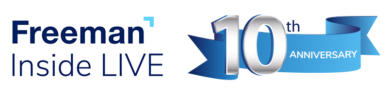
Sam Lippman, President, Lippman Connects
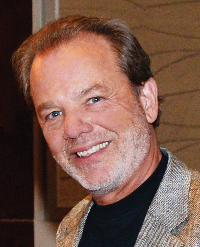
Tom Gattuso, Vice President, Events, SEMA
Freeman is an approved provider of professional continuing education (CE) hours for the Certified in Exhibition Management™ (CEM) designation offered by the International Association of Exhibitions and Events™ (IAEE). For more information on the CEM designation, please visit www.iaee.com/cem. This program qualifies as 1.5 CE credits/hours.
Freeman has been approved by the Events Industry Council (EIC) as a Preferred Provider of the Inside Live continuing education courses, which qualify for CMP continuing education credit. Determination of continuing education credit eligibility or Preferred Provider status does not imply EIC’s endorsement or assessment of education quality. For more information about the CMP credential or CMP Preferred Provider Program, please visit www.EventsCouncil.org/cmp. This program qualifies as 1.5 CE credits/hours.